AMAZON WIREFRAMES
Ending shopping cart abandonment.
Ending shopping cart abandonment.
BALSAMIQ
2 WEEKS
My role
UX Design, Prototyping
Deliverables
Low Fidelity Prototype
At a glance
This project focuses on Amazon.com’s shopping cart page and how it can be improved to reduce shopping cart abadonment. The prototype includes new features that solve issues with feedback, discoverability, and affordance, creating a more fulfilling experience for shoppers.
SKIP TO THE FINAL DESIGN?
EMPATHIZE
What is shopping cart abandonment?
Shopping cart abandonment occurs when users add items to their cart but never complete the purchase, abandoning their carts. This misaligniment with Amazon’s business goals prompted the question:
Shopping cart abandonment occurs when users add items to their cart but never complete the purchase, abandoning their carts. This misaligniment with Amazon’s business goals prompted the question:
Shopping cart abandonment occurs when users add items to their cart but never complete the purchase, abandoning their carts. This misaligniment with Amazon’s business goals prompted the question:
How might we encourage users to complete their purchases?

DEFINE
The pain points
After analyzing the current interface, I narrowed down three actionable pain points that align with UX heuristics


PROTOTYPE
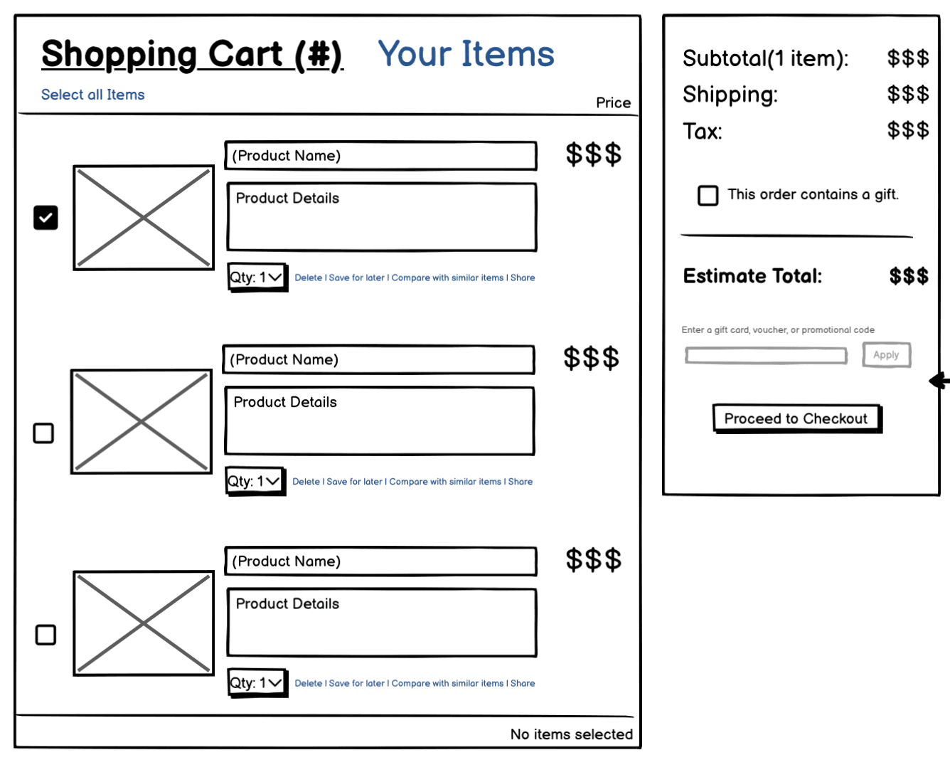
Improving discoverability
The first change I proposed was improving the discoverability of the "Your Items" and "Browsing History" sections. In my wireframe, I added a clickable “Your Items” link next to “Shopping Cart” that directs users to a separate page with this information, rather than forcing them to scroll down. This separate page also includes a navigation menu with links to browsing history and recommended products based on algorithms and customer reviews.
The "Your Items" section includes "Saved for later" and "Buy Again" items, but in the original layout, it was positioned below the fold, making it less visible. This forces users to scroll more, especially if their cart is large, which distracts them from completing their purchase.

Providing feedback
My second suggestion addressed two feedback-related issues:
Item Count: In my design, I added a “(#)” next to “Shopping Cart,” making the number of items in the cart more visible. This provides users with immediate context and reduces their need to look elsewhere, such as the icon in the menu bar, for feedback.
Estimated Total: I added more information about costs, such as taxes and shipping fees, which the original design lacked. By providing this transparent cost breakdown, users are less likely to feel surprised and more likely to complete their purchase.


Affordance for discount codes
The third improvement I implemented was the affordance for entering gift cards, vouchers, or promotional codes directly on the shopping cart page. Currently, Amazon only allows this on the checkout page. By including an input field for discount codes earlier, users can see their savings before reaching checkout, reducing the likelihood of them leaving to find promo codes and abandoning their cart.
Before
Before

After
After

REFLECTION
The benefits of rapid prototyping
This project allowed me to practice rapid prototyping using Balsamiq, which was beneficial as it kept my focus on user experience without being distracted by visual design. This helped me quickly explore and validate solutions for the pain points identified.
Future testing
Since this project focused only on low-fidelity prototyping, I wasn't able to test these designs with real users. I'd be interested to see how these solutions could impact real user behavior and improve consumer engagement rates.

Thanks for reading. Want more?


Thanks for reading. Want more?
Thanks for reading. Want more?
AMAZON WIREFRAMES
Ending shopping cart abandonment.
BALSAMIQ
2 WEEKS
My role
UX Design, Prototyping
Deliverables
Low Fidelity Prototype
At a glance
This project focuses on Amazon.com’s shopping cart page and how it can be improved to reduce shopping cart abadonment. The prototype includes new features that solve issues with feedback, discoverability, and affordance, creating a more fulfilling experience for shoppers.
SKIP TO THE FINAL DESIGN?
EMPATHIZE
What is shopping cart abandonment?
Shopping cart abandonment occurs when users add items to their cart but never complete the purchase, abandoning their carts. This misaligniment with Amazon’s business goals prompted the question:
How might we encourage users to complete their purchases?
DEFINE
The pain points
After analyzing the current interface, I narrowed down three actionable pain points that align with UX heuristics
PROTOTYPE
Improving discoverability
The first change I proposed was improving the discoverability of the "Your Items" and "Browsing History" sections. In my wireframe, I added a clickable “Your Items” link next to “Shopping Cart” that directs users to a separate page with this information, rather than forcing them to scroll down. This separate page also includes a navigation menu with links to browsing history and recommended products based on algorithms and customer reviews.
The "Your Items" section includes "Saved for later" and "Buy Again" items, but in the original layout, it was positioned below the fold, making it less visible. This forces users to scroll more, especially if their cart is large, which distracts them from completing their purchase.
Providing feedback
My second suggestion addressed two feedback-related issues:
Item Count: In my design, I added a “(#)” next to “Shopping Cart,” making the number of items in the cart more visible. This provides users with immediate context and reduces their need to look elsewhere, such as the icon in the menu bar, for feedback.
Estimated Total: I added more information about costs, such as taxes and shipping fees, which the original design lacked. By providing this transparent cost breakdown, users are less likely to feel surprised and more likely to complete their purchase.
Affordance for discount codes
The third improvement I implemented was the affordance for entering gift cards, vouchers, or promotional codes directly on the shopping cart page. Currently, Amazon only allows this on the checkout page. By including an input field for discount codes earlier, users can see their savings before reaching checkout, reducing the likelihood of them leaving to find promo codes and abandoning their cart.
Before
After
REFLECTION
The benefits of rapid prototyping
This project allowed me to practice rapid prototyping using Balsamiq, which was beneficial as it kept my focus on user experience without being distracted by visual design. This helped me quickly explore and validate solutions for the pain points identified.
Future testing
Since this project focused only on low-fidelity prototyping, I wasn't able to test these designs with real users. I'd be interested to see how these solutions could impact real user behavior and improve consumer engagement rates.
Thanks for reading. Want more?
shannonjaya5@gmail.com
shannonjaya5@gmail.com